DeskPixel Documentation
Help & reference
Using DeskPixel on mobile
How the workspace, Office sidebar, and Marketing OS adapt to a phone screen.
DeskPixel works on your phone: the same team, the same Marketing OS, laid out for a small screen. Here's what changes when you're on mobile.
The workspace
Chat takes the full screen so you can brief the team and read replies comfortably. The Office sidebar (your team's status) collapses into a bottom sheet you can pull up when you want to see who's working, then tuck away again.
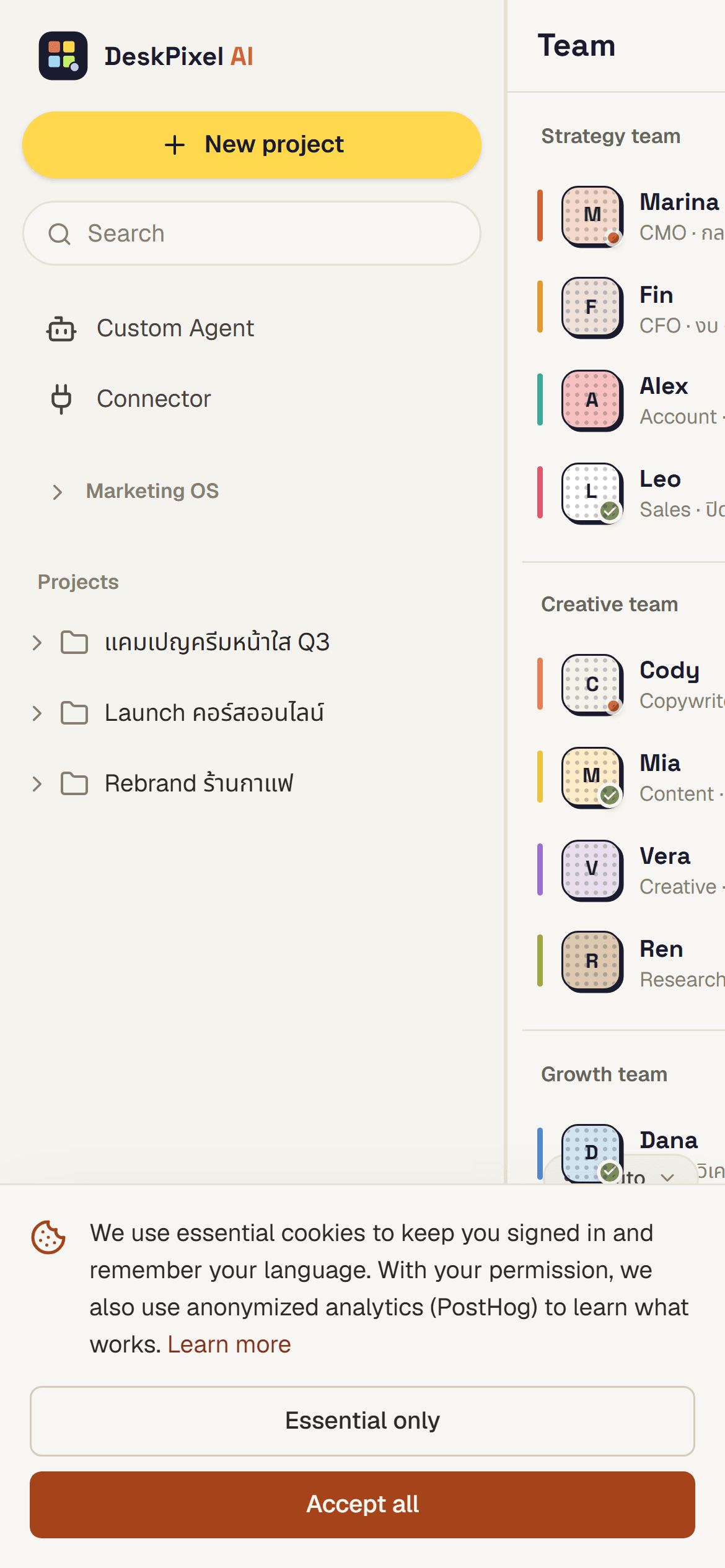
The planner & boards
Boards become vertically scrollable so columns stack naturally on a narrow screen. You can still move cards and open any item to read or edit it.
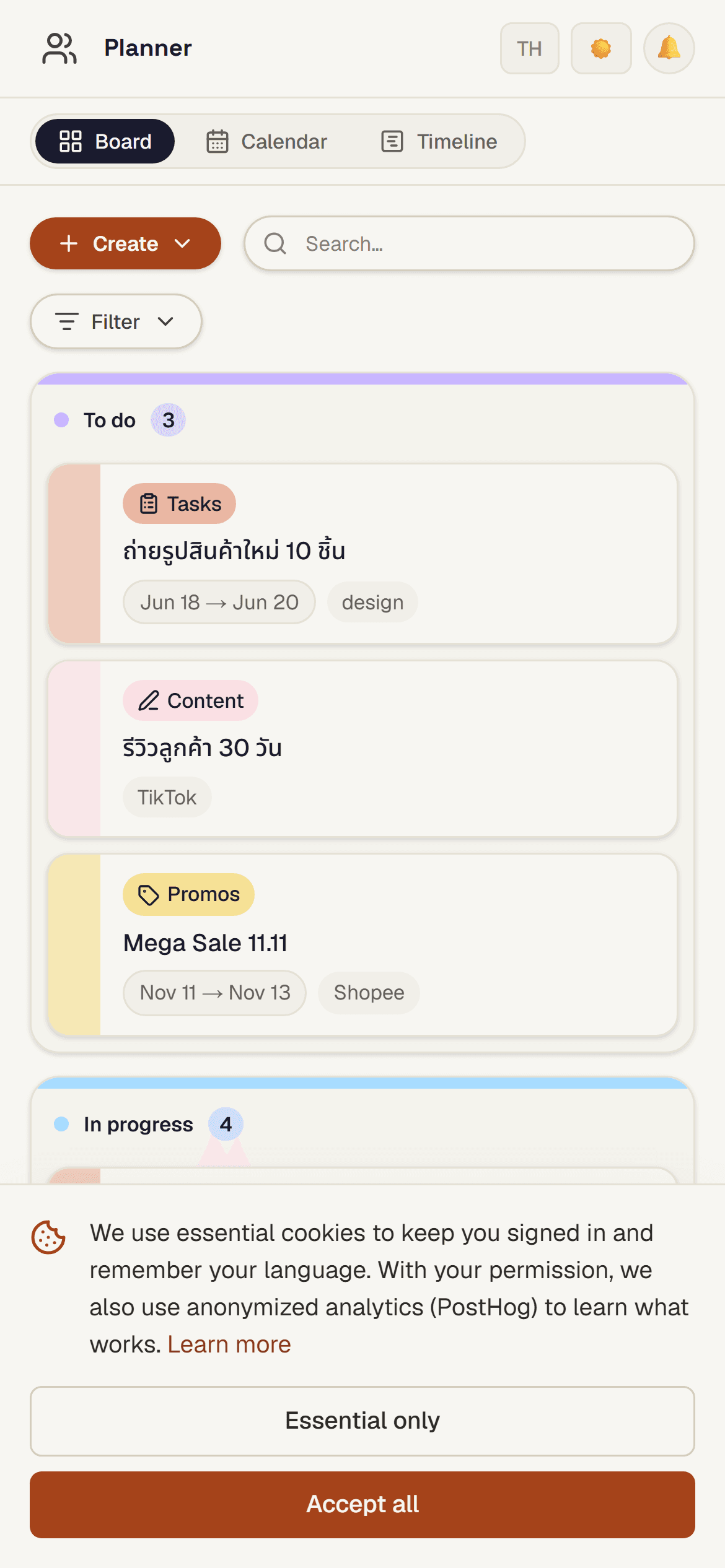
Agents
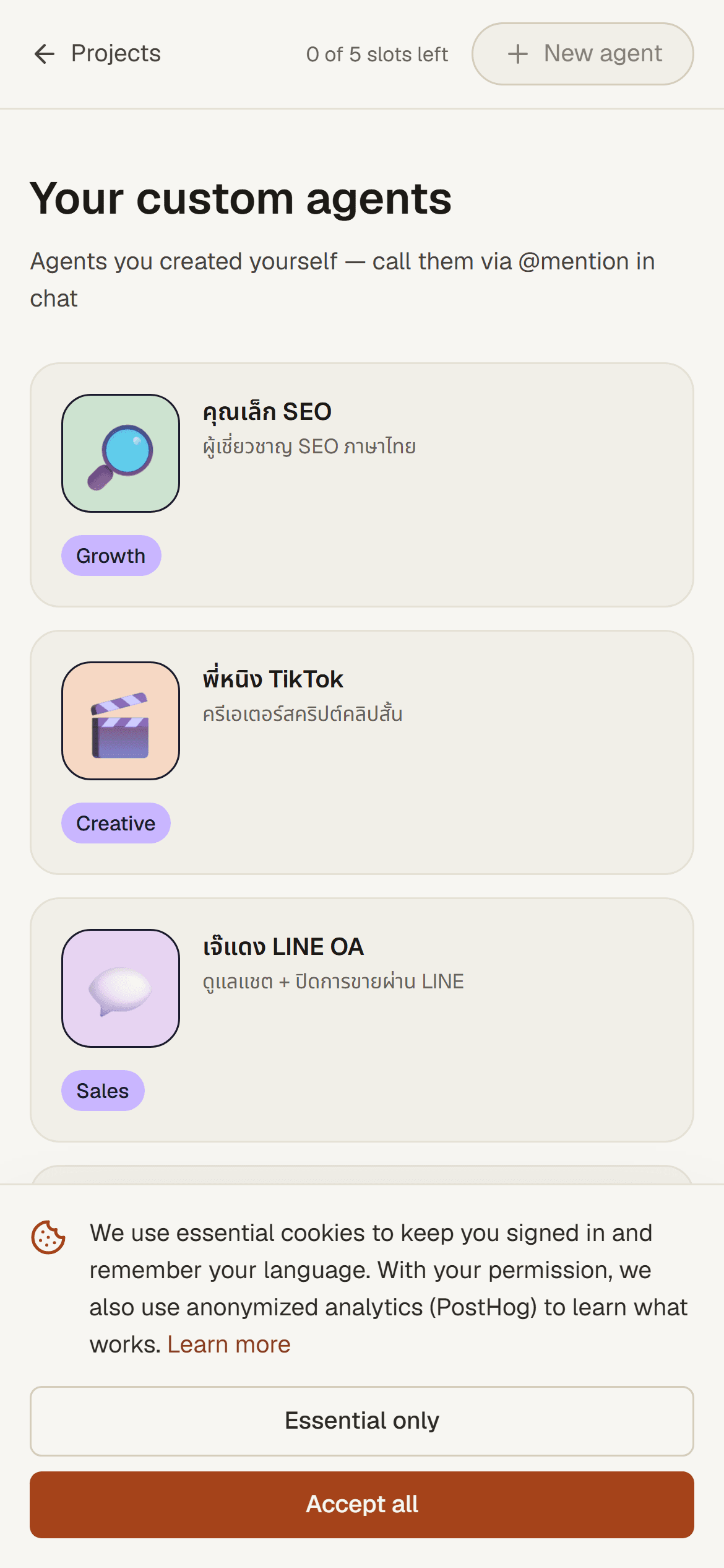
Your team and custom agents lay out as a single-column grid, with the same slot counter and @mention access.
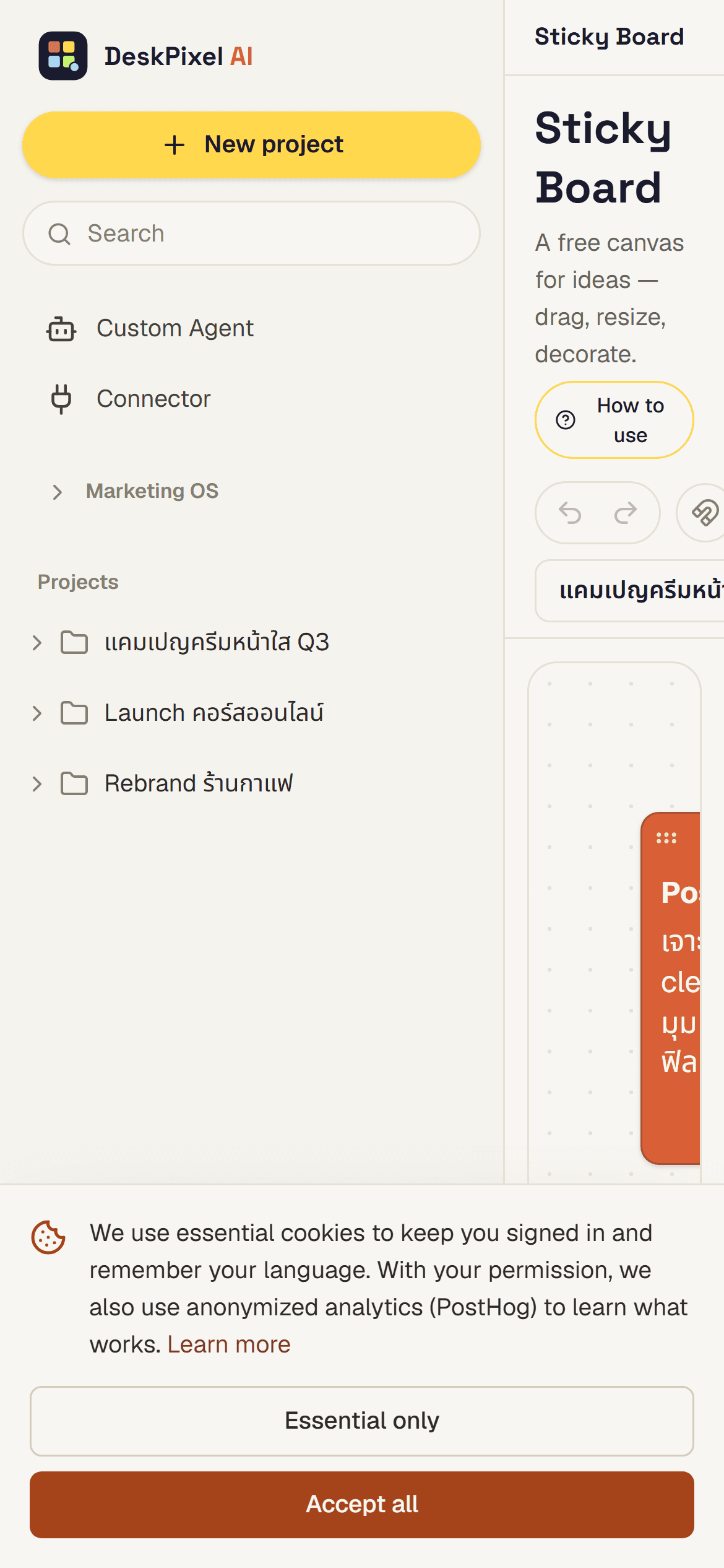
The board on mobile
Tips & tricks
- Mobile is great for approvals. Reviewing and tapping approve on the go keeps work moving between desk sessions.
- Brief short on mobile, refine at the desk. Capture the idea while it's fresh; polish later with a bigger keyboard.
- Add to home screen. DeskPixel installs as an app (PWA) for a full-screen, app-like feel.
Requirements
Mobile works on every plan. It's the same product, responsively laid out.